Armed forces fuel order form
Two things prompted me to do this project:
-
I was the product owner of a customer relationship management (CRM) proof of concept at my day job and I needed to show what I thought the customer order form should look like.
-
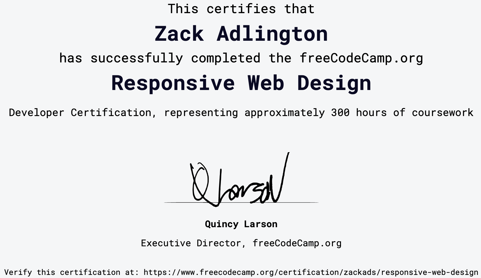
My employer was offering cash prizes for completing coding courses and challenges. One of those courses was freeCodeCamp’s Responsive Web Design certification. If I completed the course and an additional coding challenge I would be in with the chance of winning a £300 prize.
Though prompted by external stimulus to create this, the web form also provided me a good opportunity to learn the fundamentals of responsive design (CSS grid and flexbox) and really prove to myself that I could make vanilla JavaScript do cool stuff.
The brief
To meet the needs of (1) demonstrating a desired interface and (2) being in with a chance of winning a £300 prize, the web form needed to meet the following criteria:
-
Match the MoD’s existing style scheme;
-
Be credible and professional so that the product team could build a system using it as a reference;
-
Be responsive;
-
Contain at least one picture and some text;
-
Use at least three different CSS styles;
-
Use JavaScript to create working, logical functions;
-
Have a ‘reasonably easy to use’ user experience.
Why is this important?
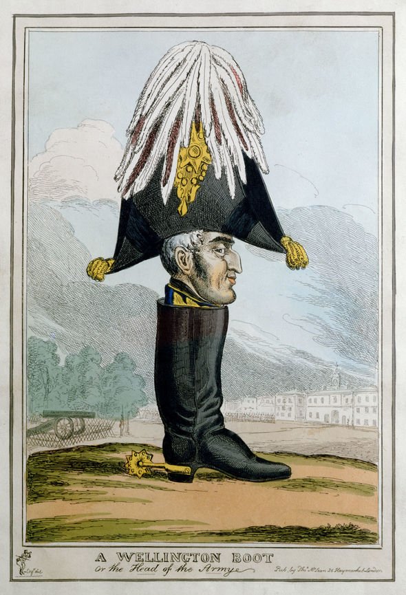
“So long as I retain an independent position, I shall see no officer under my command is debarred by attending to the futile drivelling of mere quill-driving from attending to his first duty, which is and always has been to train the private men under his command that they may without question beat any force opposed to them in the field.”
- The Duke of Wellington to the Secretary of State for War during the Peninsular Campaign1
Armed forces at peace and war have always needed energy. Whether in the form of hay for Wellington’s cavalry or corned beef hash for the discerning modern soldier, a military force’s ability to turn a fuel source in to activity is undeniably battle-winning.
Fortunately for Wellington, it seems he was spared any responsibility for buying, storing, moving, testing and disposing of his energy sources. For, as we know, if you buy anything and need to move it from A to B, there is at least some form of that much-maligned activity ‘paperwork’.
Some businesses are really good at this, keeping user-inputted information to a minimum and inferring from what they already have so the user never has to enter the same thing twice. Once they have that information, it’s used many times over in all of their processes.
Others struggle. Paper and Word document forms, sadly, remain common in many organisations. Once received from the user, information is then transposed/re-keyed/swivel-chaired2 in to other uses, introducing human error in an expensive and time-consuming way.
Enter the humble web form: a simple way for users to enter information in the browser, validate it and send it neatly packaged downstream for other processes to act on it.
Much is made of Internet of Things devices that do customers’ ordering for them when stocks get low or using AI to predict future demand.
Yet, for the kind of business that still emails Word document forms internally, this kind of transformation is likely to be out of reach both culturally and in terms of capital budgets.
I’m not saying such organisations are incapable of using IoT, AI and other technologies, just that cheap, incremental steps to address the low hanging fruit will likely deliver better ROI and a greater chance of success.
A simple HTML, CSS and JavaScript web form can be created quickly and cheaply, attached to pretty much any backend and deliver substantial benefits in reducing process waste and data quality issues.
Web form now; IoT later.
What I did
First, I completed the freeCodeCamp Responsive Web Design certification:

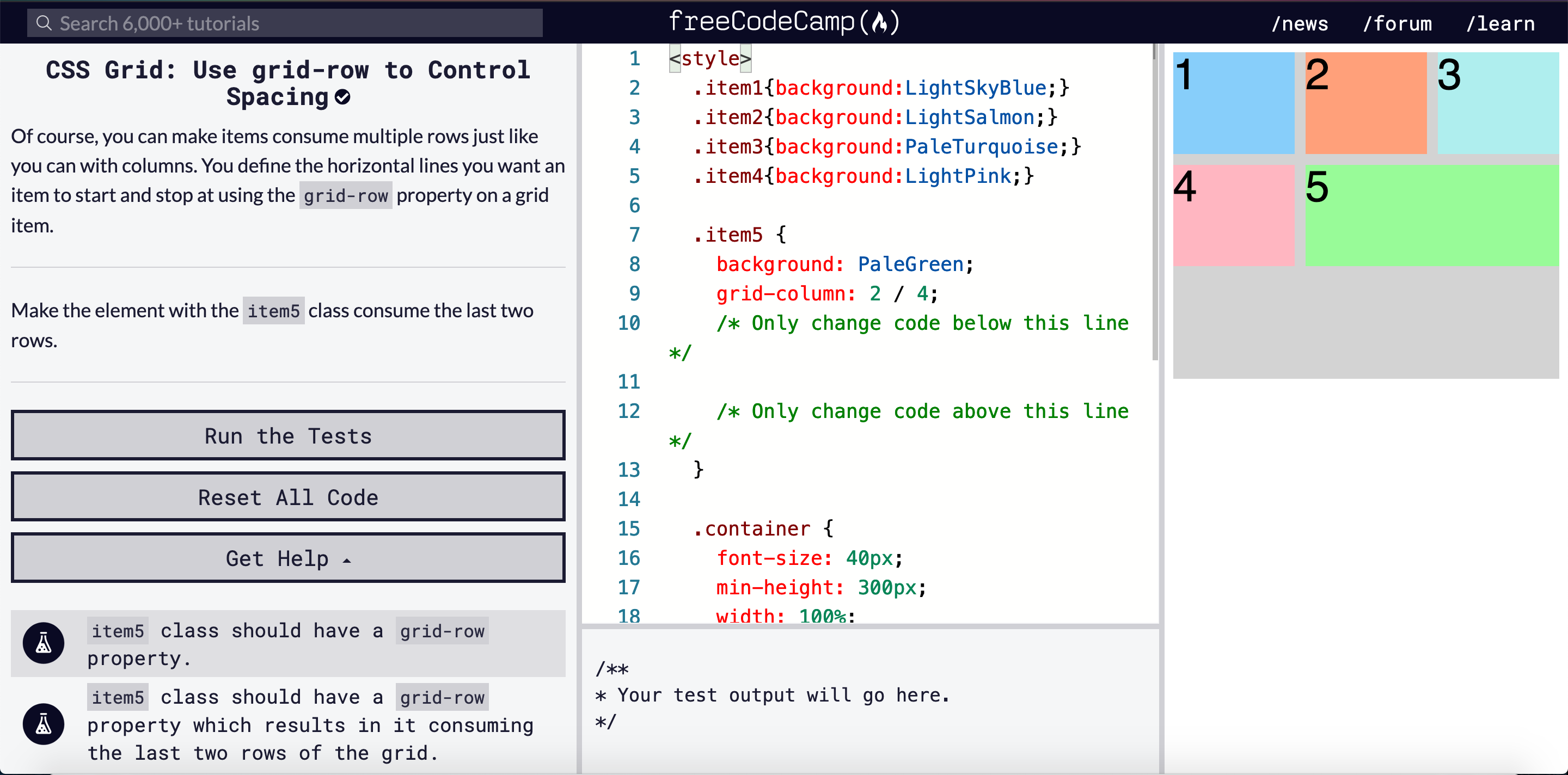
This gets you up to speed on CSS flexbox and grid. I liked the projects at the end of the freeCodeCamp course, but I didn’t like so much the ‘solve this abstract problem’ style course content:

I didn’t feel I was learning so much as going through the motions. The projects at the end were good though and helped me appreciate the significance of how grid-template-columns: works in tandem with other CSS properties on a website, for example.
I then went about putting together the web form. It went something like this:
-
Set up the responsive layout using Bootstrap grid.
-
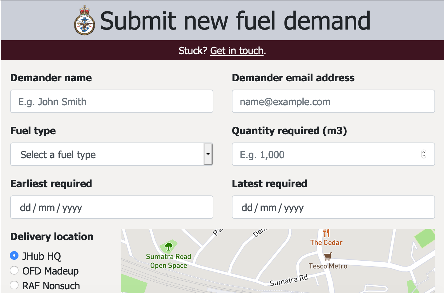
Created the form components, labels, placeholders, default values etc.
-
Implemented the Mapbox API JavaScript to show the delivery location depending on which radio box is selected.
-
Set up the form validation using Bootstrap’s built in validation classes.
-
Completed remaining form validation using JavaScript functions. (Is the ‘Earliest required’ field a date later than today? Is the ‘Latest required’ field a date later than the ‘Earliest required’ field?)
-
Added the confirmation statements to display to the user once validation is passed (“Are you really, really sure this information is correct?”).
-
Created custom CSS styles to match the purple and grey appearance of some other MoD apps.
(I’ve had an idea of a simple web form for the armed forces’ fuel demands for some time, so I didn’t feel the need to create any mock-ups. If this were for a client, I’d have done some research on whiteboarding/wireframing UX at step 0.)
The result
Here is the CodePen showing the live web form and its source code:
See the Pen J-Hub Module 1 submission by zackads (@zack_45) on CodePen.
What I learned
-
When building a website, do mobile first. Not only did this give me more space on the VS Code/Firefox split screen, but it meant no painting myself into a corner later on. Much easier to expand a mobile layout into two columns than the other way around. Result!
-
CSS form validation is not a complete solution for anything more than the basics. I had to use JavaScript to do the date logic, and it would get even more complicated if I needed to include database queries in there (check if a delivery location is capable of receiving a particular fuel type, for example). The mix of validation techniques (CSS and JS) felt like a bodge here too. I’d have preferred a single, clean way of validation, perhaps pulling the business rules from a separate source rather than hard-coding them in.
-
Implementing mapping is fun and useful. I didn’t need to do this, but I’m a sucker for a map. Anywhere the user is required to enter or interact with geographical information I think it’s really powerful to show exactly where that point is. Especially where expensive transactions like bulk fuel deliveries are being worked on, where the cost of getting a location wrong likely exceeds cumulative API costs.
Future learning opportunities
-
Hiding API keys. My public Mapbox API key is right there in the JavaScript. I’ve limited it to access from my CodePen URL so it’s probably OK to be out there (I’m on the free tier anyway), but it doesn’t feel right exposing this to the world. I would have liked a way to hide this from the browser.
-
Front-end frameworks. I’ve created a bespoke order form that the MoD could use in may other situations, but to do so would require a lot of grokking what I’ve done, separating what I’ve hard-coded in there and re-rolling it for another domain (e.g. rations, spare parts, water). A front-end framework such as React would make re-use a lot easier and consistent, plus it would allow me to hide the API key in an environment variable.
-
Back-end integration. The obvious next step for this would be to integrate it with a persistent store of the inputted data so that downstream processes could then act on it (buy the fuel, move it, etc.). I would like to set this up to call an API to submit on the form data to a server. This is a big and exciting area to look at for future projects!
Summary
After completing the freeCodeCamp course and creating the web form, I submitted it to my employer’s coding talent scheme and a few weeks later was surprised but delighted to receive a £300 prize for my work and the nice feedback below!
“Great entry. Nice design that works across multiple devices and really good use of the Mapbox API.”
Overall, a great learning experience that required me to develop some useful skills using a real-life organisational need as a basis. There’s a clear path here for future growth by learning the architecture of integrating web front-ends with server back-ends.
1 I found no authoritative attribution or source document for this quote. I suspect it was made up much later than the Peninsular War by a junior officer, perhaps disappointed that his new job involved a lot more ‘futile drivelling’ and ‘quill-driving’ than the adverts had led him or her to believe.
2 The swivel-charing/transposing/re-keying phenomenon is so common there are many terms for it.

